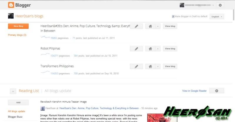
Yesterday, I was using Blogger's old user interface when I was posting news over at Robot Pilipinas, a while ago when I'm about to start posting the Kenshin Himura figure news over at my personal blog, this shows up on my screen, welcome to Blogger's new interface.
The new Blogger dashboard interface design is pretty much similar to Google+, Google's new social networking site. I'm a little confused with the new layout when I'm starting to blog, it will take time of getting used to the new interface. Aside from the layout overhaul, they also improved overview of your blogs mostly the built-in analytics graph which shows you how many users visited your site. Also, they added an earnings page as well which can check if your site is earning using Google's Adsense and Adwords. Unfortunately, the feature is not yet online, it will still use the old monetize function which will be redirected to the old layout to check your earnings.
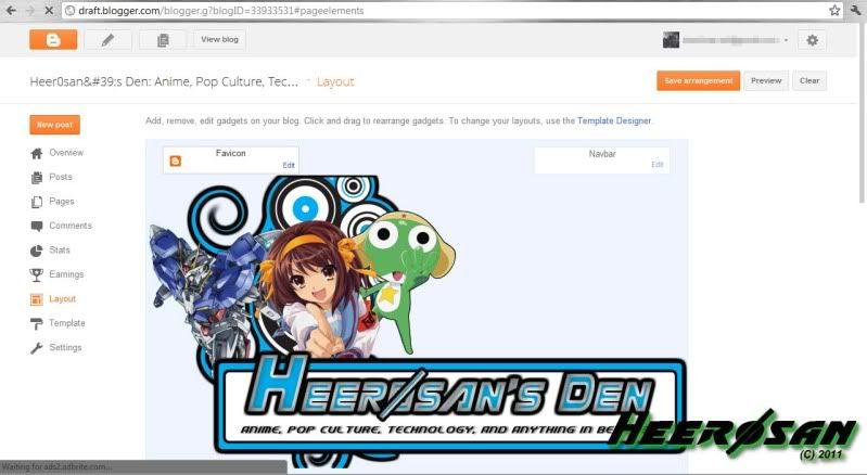
Even the design layout page has a different feel; moreover, they also added a new feature: a Favicon which you can change Blogger's default logo to your custom logo that will appear on your internet browser's tab. Unfortunately, I tried using it replacing the Blogger icon with my custom icon, probably it has to do with my current template, anyway I can do that some other time.
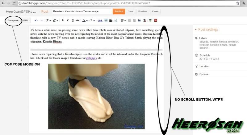
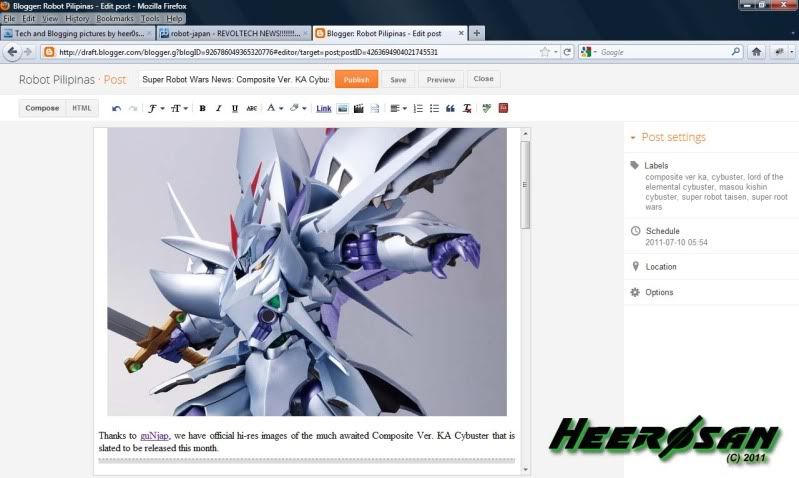
The biggest gripe I have with this is that when you are typing on compose mode, there is no scroll button to click if you're writing a very long blog (shown example above). You have to use the scroll wheel on your mouse or scroll pad on your laptop to scroll up or down. I don't know why I can't see it probably because I'm using Chrome, it seems the scroll bar appears when I'm using I'll try it on Firefox (I'm using ver. 5, shown image below) when I post news on Robot Pilipinas.
With so many features, I can see now why Google is working hard in unifying their products on Google+ as one, as I'm thinking of the recent news I read that Blogger and Picasa will rebrand because of this, let's just hope the URL's doesn't change, I hate losing site visitors mostly Robot Pilipinas traffic is starting to get better. We'll just see in the coming days/months until Google+ formally launches.


No comments:
Post a Comment